1. In row 1 of the following spreadsheet, the words rank, name, population, and county are called what?
A | B | C | D | |
1 | Rank | Name | Population | County |
2 | 1 | Charlotte | 885,708 | Mecklenburg |
3 | 2 | Raleigh | 474,069 | Wake (seat), Durham |
4 | 3 | Greensboro | 296,710 | Guilford |
5 | 4 | Durham | 278,993 | Durham (seat), Wake, Orange |
6 | 5 | Winston-Salem | 247,945 | Forsyth |
7 | 6 | Fayetteville | 211,657 | Cumberland |
8 | 7 | Cary | 170,282 | Wake, Chatham |
9 | 8 | Wilmington | 123,784 | New Hanover |
10 | 9 | High Point | 112,791 | Guilford, Randolph, Davidson, Forsyth |
11 | 10 | Concord | 96,341 | Cabarrus |
- Criteria
- Descriptors
- Characteristics
- Attributes
Explanation: In the spreadsheet, the phrases "rank," "name," "population," and "county" are commonly referred to as column headings or field names. Row 1 of the spreadsheet has these words. They are labels that are assigned to each column in the spreadsheet, and they indicate the kind of information that is anticipated to be present in each column in particular. When it comes to organizing and recognizing the substance of the data included inside the spreadsheet, column headings are an extremely important component.
2. In the following spreadsheet, where can you find all of the attributes—also known as the observation—of Fayetteville?
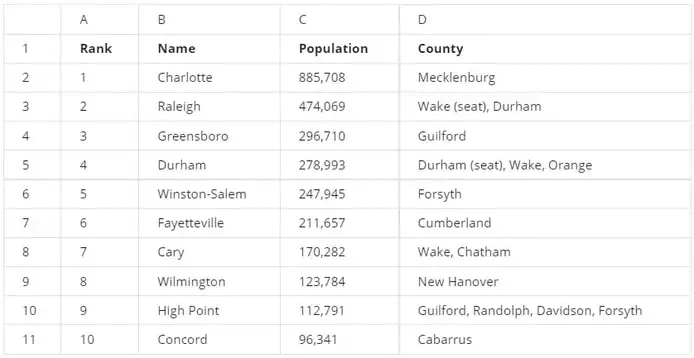
- Cell B7
- Row 6
- Column B
- Row 7
3. In the following spreadsheet, what feature was used to alphabetize the city names in column B?
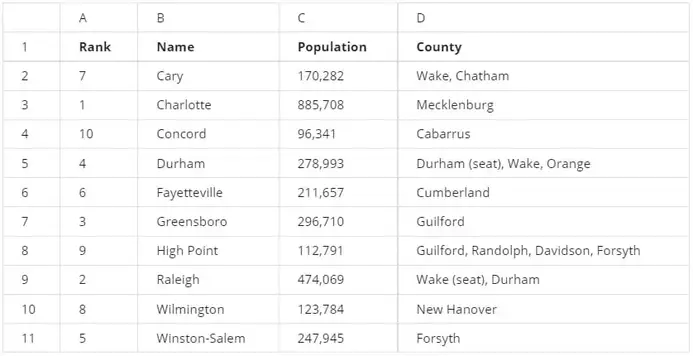
- Name range
- Sort range
- Randomize range
- Organize range
Explanation: Neither am I able to access nor do any analysis on the particular spreadsheet that you are referring to. In general, however, the "Sort" tool of spreadsheet applications such as Microsoft Excel or Google Sheets may be used to alphabetize city names that are included inside a column.
If you are using Excel, for instance, you may alphabetize the data by selecting the column that contains the names of the cities, going to the "Data" tab, and selecting either the "Sort A to Z" or the "Sort Z to A" option from the drop-down menu.
There is a possibility that the particular stages will change depending on whether you are using a different spreadsheet program or if the spreadsheet has been modified by means of a script or function. In order to offer a more accurate response, kindly go to the manual of the program or provide further information.
4. To find the average population of the cities in this spreadsheet, you type =AVERAGE. What is the proper way to type the range that will complete your function?

- C2:C11
- C2,C11
- C2-C11
- C2*C11
Explanation: For the purpose of determining the average population of the cities that are included inside a certain column, it is customary to use the AVERAGE function to define the range of cells that hold the population data.
5. You are working with a database table named employee that contains data about employees. You want to review all the columns in the table.
You write the SQL query below. Add a FROM clause that will retrieve the data from the employee table.
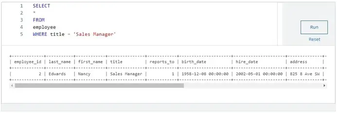
What employee has the job title of Sales Manager?
- Margaret Park
- Michael Mitchell
- Andrew Adams
- Nancy Edwards
6. You are working with a database table that contains invoice data. The customer_id column lists the ID number for each customer. You are interested in invoice data for the customer with ID number 28.

You write the SQL query below. Add a WHERE clause that will return only data about the customer with ID number 28.
What is the billing city for the customer with ID number 28?
- Dijon
- Salt Lake City
- Bangalore
- Buenos Aires
Explanation: You may use a SELECT statement with a WHERE clause to filter the results if you are interested in getting invoice data for the customer with ID number 28 from a database table. This means that you can use the statement to retrieve the information. Depending on the database management system that you are using, the syntax may be different in its precise form.
7. A data analyst creates the following visualization to clearly demonstrate how much more populous Charlotte is than the next-largest North Carolina city, Raleigh. What type of chart is it?
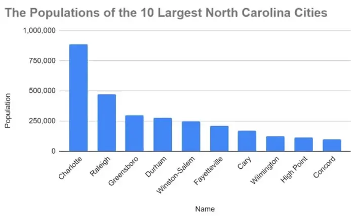
- A column, or bar, chart
- A scatter chart
- A pie chart
- A line chart
Explanation: The visualization that you are referring to is not something that I am able to view. Could you offer a description of it or other information on the chart? As soon as I get additional information, I will be able to assist in determining the style of graphic that the data analyst used to illustrate the disparity in population between Charlotte and Raleigh.
8. A data analyst wants to demonstrate how the population in Charlotte has increased over time. They create this data visualization. This is an example of an area chart.
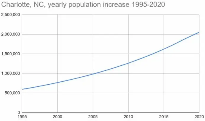
- True
- False
Explanation: On the other hand, if you want to visualize the changes in population over time, an area chart is a good option to consider. There is a clear visual depiction of the level of change that is provided by an area chart. This is because the area between the line that connects the data points and the axis is filled. When comparing numbers over a continuous period of time, this sort of chart is particularly useful for displaying patterns because of its effectiveness. Generally speaking, the x-axis is used to indicate time, while the y-axis is used to represent the population or the numerical values.
The data analyst seems to have used an area chart in order to demonstrate the progression of the population in Charlotte over the course of time, therefore highlighting both the trend and the scale of the population growth trend.
9. In row 1 of the following spreadsheet, the words rank, name, population, and county are called what?
A | B | C | D | |
1 | Rank | Name | Population | County |
2 | 1 | Charlotte | 885,708 | Mecklenburg |
3 | 2 | Raleigh | 474,069 | Wake (seat), Durham |
4 | 3 | Greensboro | 296,710 | Guilford |
5 | 4 | Durham | 278,993 | Durham (seat), Wake, Orange |
6 | 5 | Winston-Salem | 247,945 | Forsyth |
7 | 6 | Fayetteville | 211,657 | Cumberland |
8 | 7 | Cary | 170,282 | Wake, Chatham |
9 | 8 | Wilmington | 123,784 | New Hanover |
10 | 9 | High Point | 112,791 | Guilford, Randolph, Davidson, Forsyth |
11 | 10 | Concord | 96,341 | Cabarrus |
- Criteria
- Descriptors
- Characteristics
- Attributes
Explanation: In the spreadsheet, the phrases "rank," "name," "population," and "county" are commonly referred to as column headings or field names. Row 1 of the spreadsheet has these words. As labels for each column in the spreadsheet, they provide a description of the kind of data that is included inside each individual column. They act as labels for each column. When it comes to organizing and recognizing the substance of the data included inside the spreadsheet, column headings are an extremely important component.
10. Fill in the blank: In row 8 of the following spreadsheet, you can find the _____ of Cary.
A | B | C | D | |
1 | Rank | Name | Population | County |
2 | 1 | Charlotte | 885,708 | Mecklenburg |
3 | 2 | Raleigh | 474,069 | Wake (seat), Durham |
4 | 3 | Greensboro | 296,710 | Guilford |
5 | 4 | Durham | 278,993 | Durham (seat), Wake, Orange |
6 | 5 | Winston-Salem | 247,945 | Forsyth |
7 | 6 | Fayetteville | 211,657 | Cumberland |
8 | 7 | Cary | 170,282 | Wake, Chatham |
9 | 8 | Wilmington | 123,784 | New Hanover |
10 | 9 | High Point | 112,791 | Guilford, Randolph, Davidson, Forsyth |
11 | 10 | Concord | 96,341 | Cabarrus |
- attribute
- format
- criteria
- observation
Explanation: It is possible to locate the information or characteristics of Cary in row 8 of the spreadsheet that is provided below. According to the layout of the spreadsheet, the particular information that is included in row 8 would be representative of the characteristics or features that are associated with the entry for Cary in the spreadsheet. These qualities and details may include the city's rank, name, population, and county.
11. To find the average population of the cities in this spreadsheet, what is the correct AVERAGE function syntax?
A | B | C | D | |
1 | Rank | Name | Population | County |
2 | 1 | Charlotte | 885,708 | Mecklenburg |
3 | 2 | Raleigh | 474,069 | Wake (seat), Durham |
4 | 3 | Greensboro | 296,710 | Guilford |
5 | 4 | Durham | 278,993 | Durham (seat), Wake, Orange |
6 | 5 | Winston-Salem | 247,945 | Forsyth |
7 | 6 | Fayetteville | 211,657 | Cumberland |
8 | 7 | Cary | 170,282 | Wake, Chatham |
9 | 8 | Wilmington | 123,784 | New Hanover |
10 | 9 | High Point | 112,791 | Guilford, Randolph, Davidson, Forsyth |
11 | 10 | Concord | 96,341 | Cabarrus |
- AVERAGE(C2:C11)
- =AVERAGE(C2:C11)
- AVERAGE(C2-C11)
- =AVERAGE(C2-C11)
12. You are working with a database table that contains invoice data. The customer_id column lists the ID number for each customer. You are interested in invoice data for the customer with ID number 35.
You write the SQL query below. Add a WHERE clause that will return only data about the customer with ID number 35.
After you run your query, use the slider to view all the data presented.
What is the billing country for the customer with ID number 35?
- Ireland
- Argentina
- Portugal
- India
13. A data analyst creates the following visualization to clearly demonstrate how much more populous Charlotte is than the next-largest North Carolina city, Raleigh. It’s called a line chart

- True
- False
Explanation: It would seem that there is a possibility of some misunderstanding. A line chart is a kind of chart that is used to depict data points that are spread out across a continuous period or time range and are connected by straight lines. Typically, it is used to demonstrate patterns or shifts in data over a period of time.
It is possible that a bar chart or a column chart might be better appropriate for the purpose of demonstrating the difference in population between Charlotte and Raleigh. These sorts of charts are useful for comparing different figures, such as the populations of several cities, and they are designed to do so effectively.
If you have a line chart that is able to present the information regarding the population disparity between Charlotte and Raleigh in an effective manner, that would be fantastic! Both the particular visualization objectives and the data that is being shown should be taken into consideration while selecting the chart.
14. The column attributes for rank, name, population, and county are located in which row of the following spreadsheet?
A | B | C | D | |
1 | Rank | Name | Population | County |
2 | 1 | Charlotte | 885,708 | Mecklenburg |
3 | 2 | Raleigh | 474,069 | Wake (seat), Durham |
4 | 3 | Greensboro | 296,710 | Guilford |
5 | 4 | Durham | 278,993 | Durham (seat), Wake, Orange |
6 | 5 | Winston-Salem | 247,945 | Forsyth |
7 | 6 | Fayetteville | 211,657 | Cumberland |
8 | 7 | Cary | 170,282 | Wake, Chatham |
9 | 8 | Wilmington | 123,784 | New Hanover |
10 | 9 | High Point | 112,791 | Guilford, Randolph, Davidson, Forsyth |
11 | 10 | Concord | 96,341 | Cabarrus |
- 10
- 1
- 2
- 11
Explanation: In the spreadsheet that is shown below, the column characteristics for "rank," "name," "population," and "county" are normally found in the first row, which is referred to as row 1. Row 1 is often used in a spreadsheet for the purpose of displaying column headings or field names. This row also serves to provide labels for each column and to describe the kind of data that each column represents.
15. In the following spreadsheet, the observation of Greensboro describes all of the data in row 4.
A | B | C | D | |
1 | Rank | Name | Population | County |
2 | 1 | Charlotte | 885,708 | Mecklenburg |
3 | 2 | Raleigh | 474,069 | Wake (seat), Durham |
4 | 3 | Greensboro | 296,710 | Guilford |
5 | 4 | Durham | 278,993 | Durham (seat), Wake, Orange |
6 | 5 | Winston-Salem | 247,945 | Forsyth |
7 | 6 | Fayetteville | 211,657 | Cumberland |
8 | 7 | Cary | 170,282 | Wake, Chatham |
9 | 8 | Wilmington | 123,784 | New Hanover |
10 | 9 | High Point | 112,791 | Guilford, Randolph, Davidson, Forsyth |
11 | 10 | Concord | 96,341 | Cabarrus |
- True
- False
Explanation: It seems as if there may be some confusion about the situation. Instead of referring to a column, the word "observation" is often used to refer to a particular record or row when it is used in the context of spreadsheets and databases.
If you are referring to the data related to Greensboro, it would typically be in a specific row, such as row 4. In a spreadsheet, each row represents a distinct observation or record, and the information included inside that row offers details on a specific entity (in this example, Greensboro).
As a result, the observation of Greensboro would, in fact, explain all of the data that is located in row 4 of the spreadsheet given the context being discussed.
16. Fill in the blank: In the following spreadsheet, the _____ feature was used to alphabetize the city names in column B
A | B | C | D | |
1 | Rank | Name | Population | County |
2 | 7 | Cary | 170,282 | Wake, Chatham |
3 | 1 | Charlotte | 885,708 | Mecklenburg |
4 | 10 | Concord | 96,341 | Cabarrus |
5 | 4 | Durham | 278,993 | Durham (seat), Wake, Orange |
6 | 6 | Fayetteville | 211,657 | Cumberland |
7 | 3 | Greensboro | 296,710 | Guilford |
8 | 9 | High Point | 112,791 | Guilford, Randolph, Davidson, Forsyth |
9 | 2 | Raleigh | 474,069 | Wake (seat), Durham |
10 | 8 | Wilmington | 123,784 | New Hanover |
11 | 5 | Winston-Salem | 247,945 | Forsyth |
- organize range
- randomize range
- sort range
- name range
17. Fill in the blank: A data analyst creates a table, but they realize this isn’t the best visualization for their data. To fix the problem, they decide to use the _____ feature to change it to a column chart.
- image
- filter view
- rename
- chart editor
Explanation: In order to resolve the issue, they make the decision to make use of the "Change Chart Type" function in order to convert it into a column chart. This function is often accessible in spreadsheet software such as Microsoft Excel or Google Sheets, and it enables users to move between several chart formats in order to improve the display of their data.
18. If a data analyst wants to list the cities in this spreadsheet alphabetically, instead of numerically, what feature can they use in column B?
A | B | C | D | |
1 | Rank | Name | Population | County |
2 | 1 | Charlotte | 885,708 | Mecklenburg |
3 | 2 | Raleigh | 474,069 | Wake (seat), Durham |
4 | 3 | Greensboro | 296,710 | Guilford |
5 | 4 | Durham | 278,993 | Durham (seat), Wake, Orange |
6 | 5 | Winston-Salem | 247,945 | Forsyth |
7 | 6 | Fayetteville | 211,657 | Cumberland |
8 | 7 | Cary | 170,282 | Wake, Chatham |
9 | 8 | Wilmington | 123,784 | New Hanover |
10 | 9 | High Point | 112,791 | Guilford, Randolph, Davidson, Forsyth |
11 | 10 | Concord | 96,341 | Cabarrus |
- Name range
- Randomize range
- Organize range
- Sort range
19. A data analyst types =POPULATION(C2:C11) to find the average population of the cities in this spreadsheet. However, they realize they used the wrong formula. What syntax will correct this function?
A | B | C | D | |
1 | Rank | Name | Population | County |
2 | 1 | Charlotte | 885,708 | Mecklenburg |
3 | 2 | Raleigh | 474,069 | Wake (seat), Durham |
4 | 3 | Greensboro | 296,710 | Guilford |
5 | 4 | Durham | 278,993 | Durham (seat), Wake, Orange |
6 | 5 | Winston-Salem | 247,945 | Forsyth |
7 | 6 | Fayetteville | 211,657 | Cumberland |
8 | 7 | Cary | 170,282 | Wake, Chatham |
9 | 8 | Wilmington | 123,784 | New Hanover |
10 | 9 | High Point | 112,791 | Guilford, Randolph, Davidson, Forsyth |
11 | 10 | Concord | 96,341 | Cabarrus |
- AVERAGE(C2:C11)
- =AVERAGE(C2:C11)
- AVERAGE(C2-C11)
- =AVERAGE(C2-C11)
20. A data analyst wants to demonstrate how the population in Charlotte has increased over time. They create the chart below. What is this type of chart called?

- Area chart
- Column chart
- Line chart
- Bar chart
21. A data analyst wants to demonstrate a trend of how something has changed over time. What type of chart is best for this task?
- Bar
- Line
- Column
- Area
Explanation: I am sorry, but I am unable to see the chart that you are referring to. Could you offer a description of it or other information on the chart? As soon as I get additional information, I will be able to assist in determining the style of graphic that the data analyst used to illustrate the growth in population that Charlotte has had over the course of time.

